Creating more paths to home ownership
Reliance Capital is one of India's largest financial services organizations. Reliance Home Finance (RHF), one of its subsidiaries, offer home loans, construction finance, and property appraisal and buying services. RHF serves over 30,000 customers in 90 locations across the country.
The goal of this project was to create an engaging browsing experience and streamlined loan application flow on the Reliance Home Finance's website to increase new business.
Challenge
Improve the browsing and application experience on the company's website.
Outcome
I developed responsive price calculators, and a streamlined loan application flow for the Reliance Home Finance website.
Scope Of Work
- Mobile User Experience
- User Interface Design
- Responsive Web Design
- Web User Experience
- Visual Design
Client
Project Lead
Sheena Laha
Challenge
Incentivize identity verification
Aadhar is a voluntary national identity system recently launched by the Indian government to help administer and deliver government benefits and subsidies accurately. Additionally, the system gives citizens an easy way to verify their identity and information with institutions.
RHF's intention for the project was to increase engagement around their home loan offerings and implement Aadhar into their application system to increase incoming leads from their website.
Features
Transparency and personal connection
For the average citizen, the financial world is often opaque and hard to understand. Potential customers have to spend hours researching long documents with complex language to find the right financial solution for their needs. One strategy to nurture potential customers is to provide necessary information in a simple, personal manner.
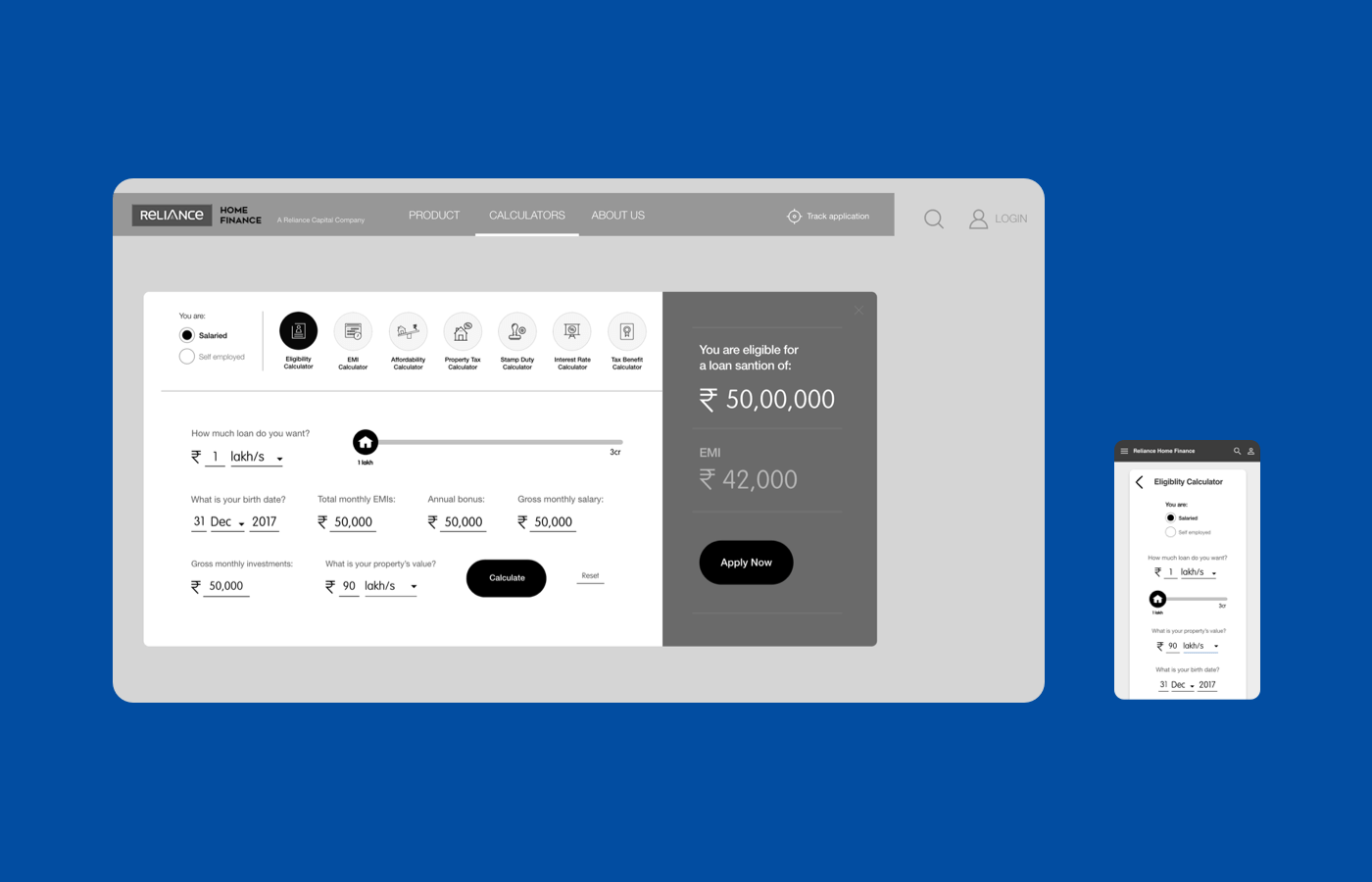
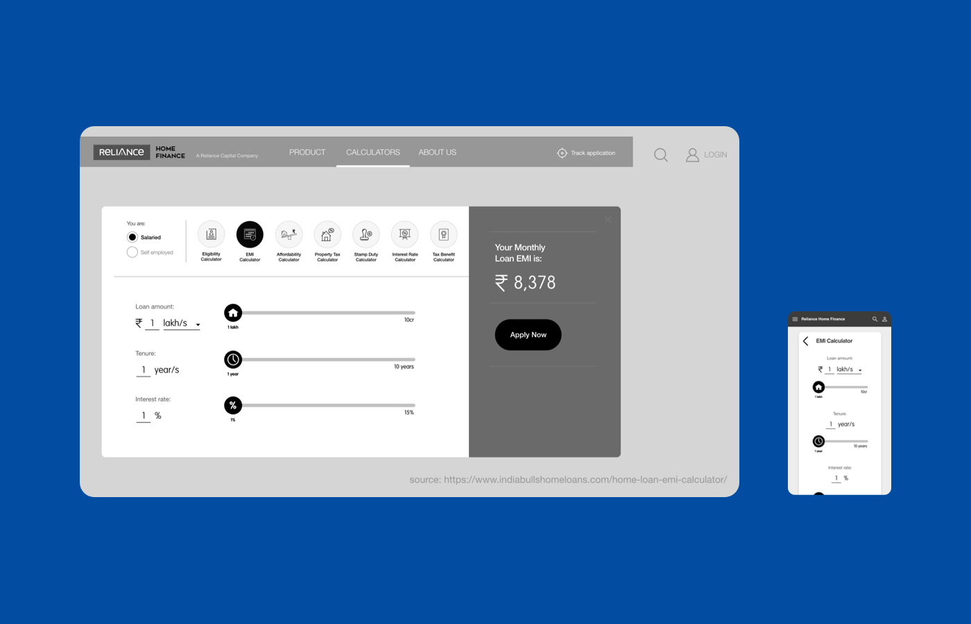
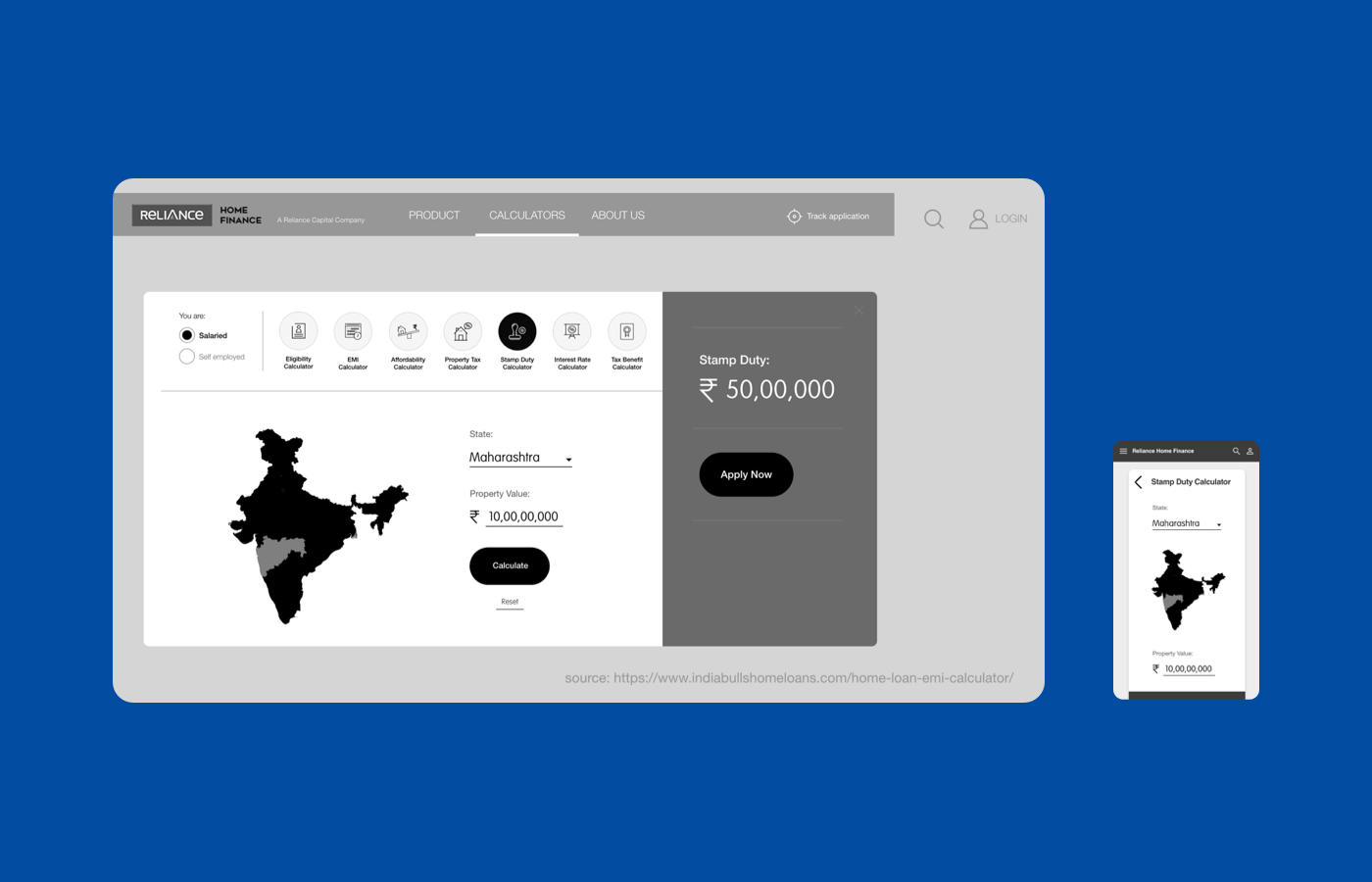
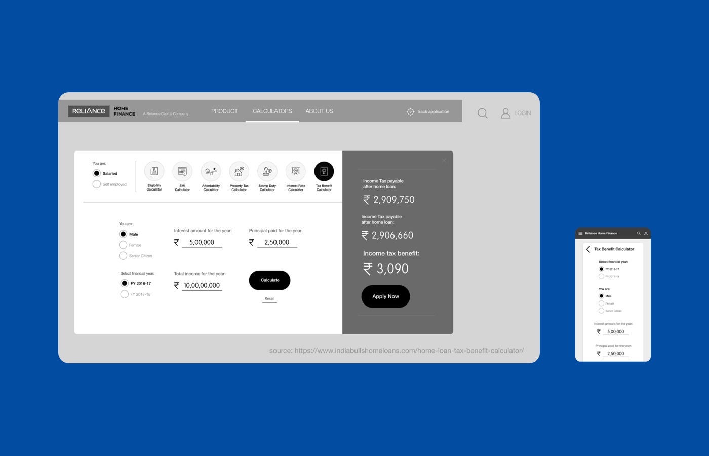
I designed a series of responsive financial calculators for the RHF website to provide personal price transparency to prospective customers. Once prospects feel confident, they can use their information to start the loan application process.
Interaction
Streamlining the application process
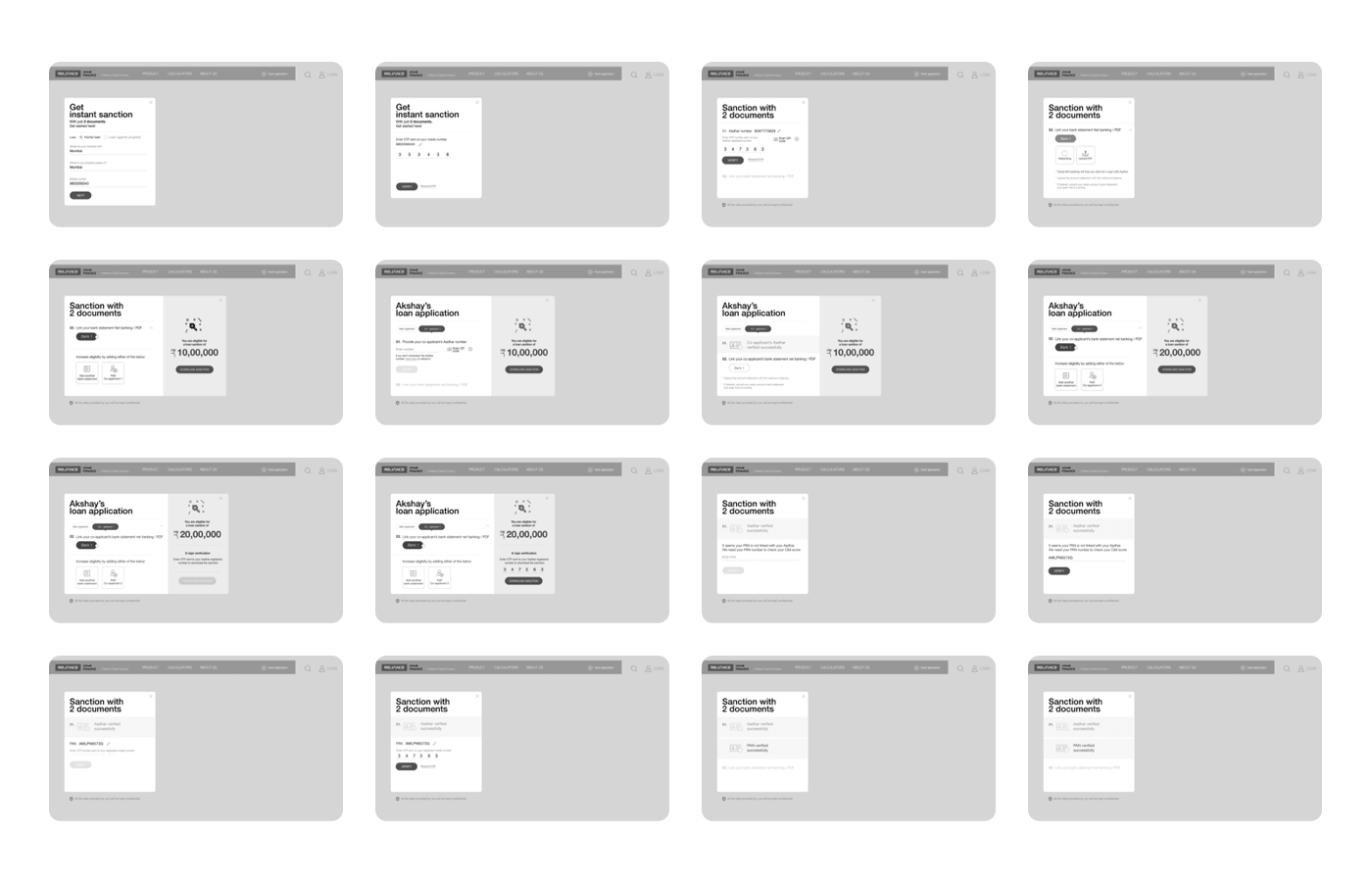
After designing the financial calculators, I moved on to implementing Aadhar data into the new loan application flow. It's not enough to optimize the expected path to create an exceptional user experience for enterprise. It's crucial to consider the alternatives: all the edge cases and error states that can happen in complex financial processes.
In the process of improving the loan application experience, I developed more than 20+ wireframes and mockups to map out all of the possible system states and variations.
Design
A friendlier form
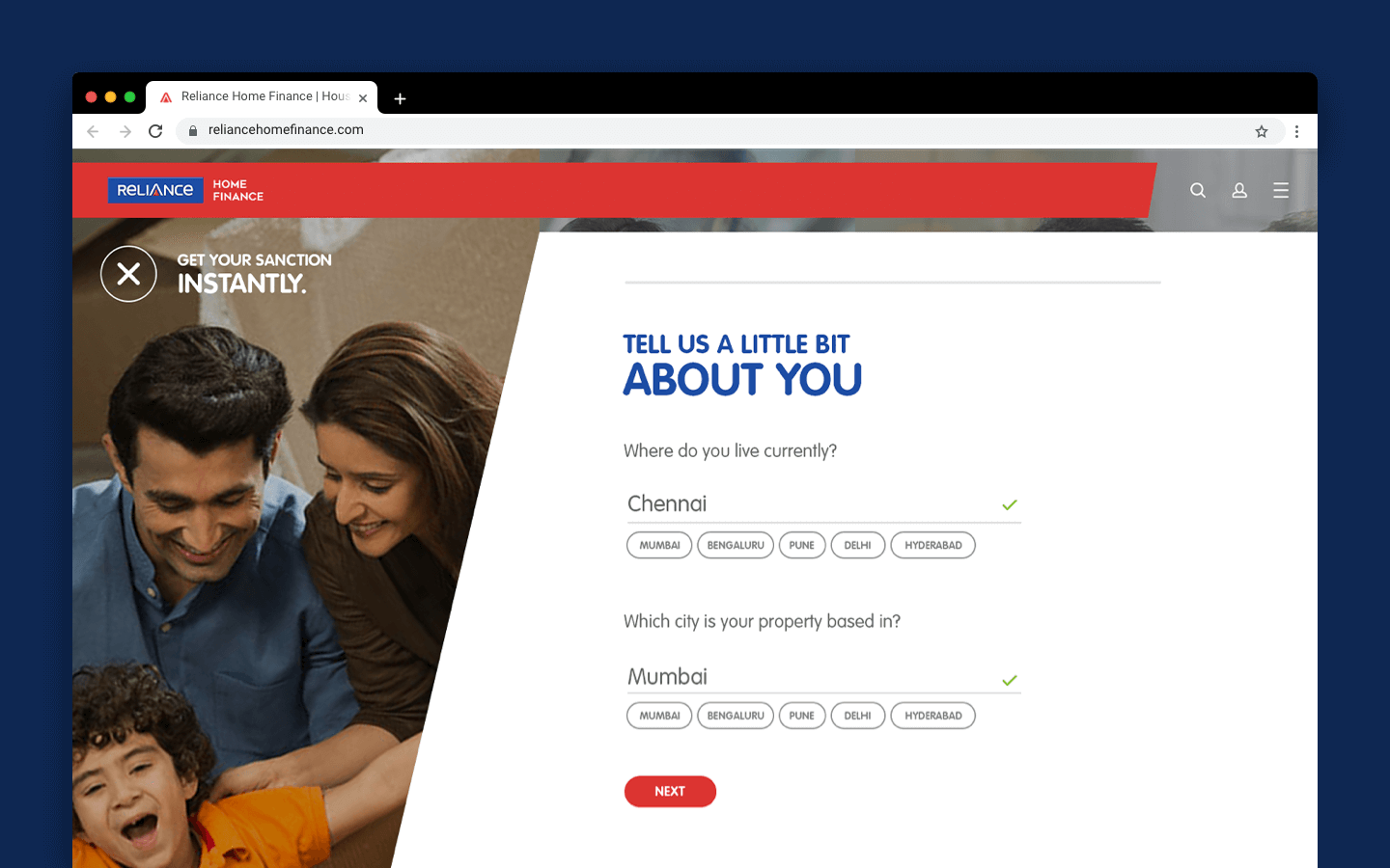
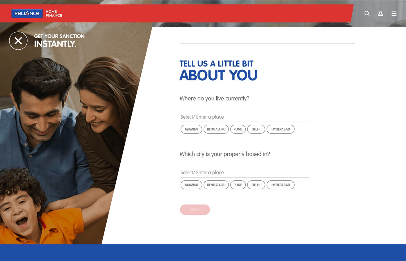
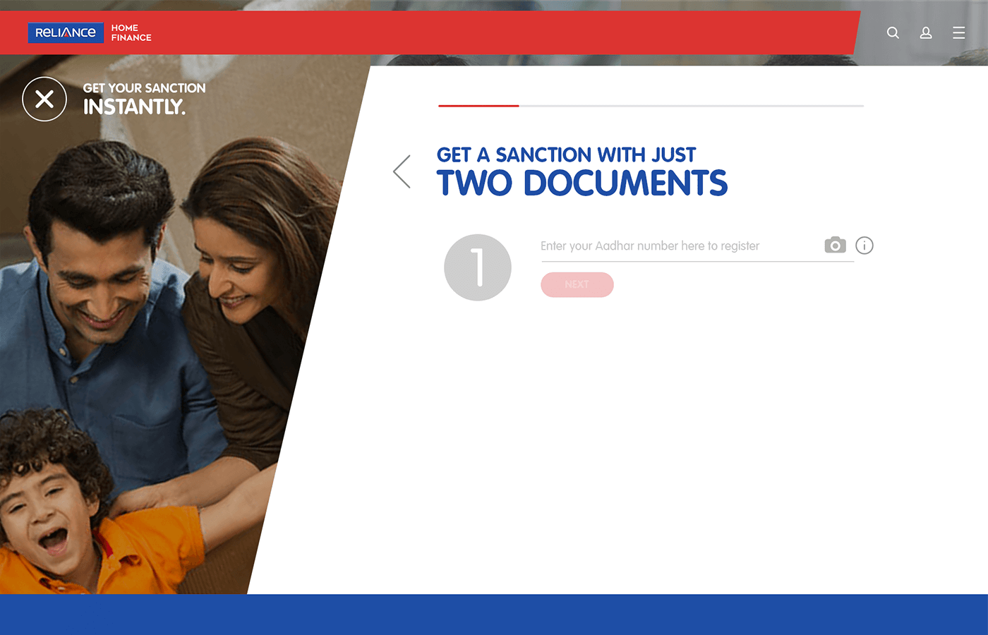
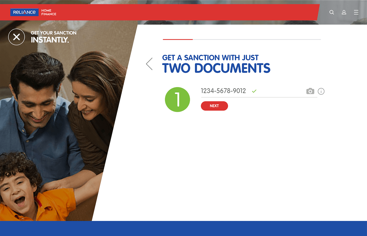
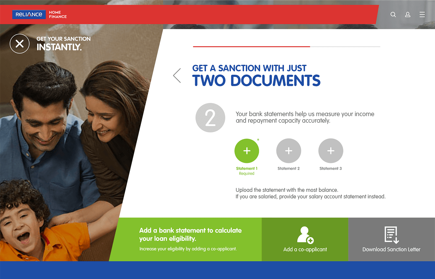
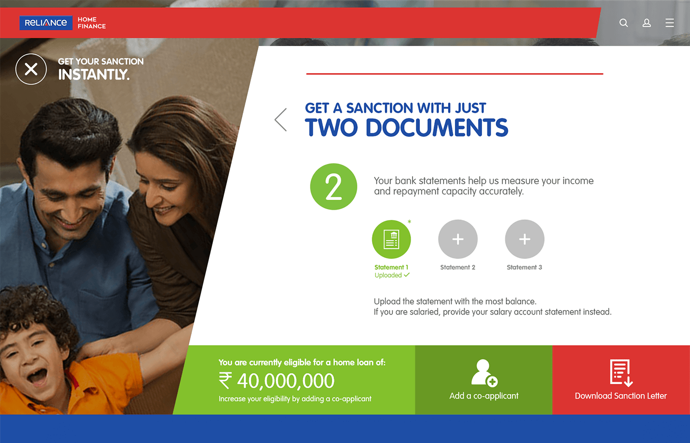
After developing the wireframes, I created a variety of visual layouts for the loan application experience, which would take place on a larger viewport. After going through 3 iterations, we chose to implement a layout that had energetic angular elements and a pleasant image of a family that would create feelings of excitement and comfort for the end-user.
I used the principles of progressive disclosure to create shorter individual stages for each part of the loan application experience. By only revealing what is necessary, it keeps the end-user engaged without making them feel overwhelmed:
Progressive disclosure is an interaction design pattern that sequences information and actions across several screens (e.g., a step-by-step signup flow). The purpose is to lower the chances that users will feel overwhelmed by what they encounter.
Results
More visitors, time spent on site.
The new calculator pages gained more average visitors from both desktop and mobile, who spent more time-on-page than other informational pages on the website. The optimized loan application flow boosted form completion rates by 32% and new customer sign-ups by an average of 13%.
